Vault
Internal search tool and database that houses all video content produced and published by ATTN:, allowing employees to share with a potential partner, reference past content, and obtain statistics on video performance.
Vault
Vault is an internal creative tool that teams within ATTN: use to find any of our videos in order to share with a potential partner, reference past content, and obtain statistics on video performance. Prior to the introduction of this search and database tool, employees would rely on various platforms or ask others where to locate a video, resulting in inefficiencies across multiple teams. Since the introduction of Vault, there’s been a strong adoption and retention of the tool with employees reporting a decrease in time spent searching for videos.
Problem
As a media company, ATTN: shoots and edits an abundance of video content every month, consistently publishing original, editorial, and breaking/trending content. Naturally this leads to a large amount of video content and the question of how to maintain it all. Teams at ATTN: have access to different tools and varying levels of the permissions, making it trickier to find videos when there isn’t a central location that can be accessed by everyone. Employees not only struggle to find videos, but also cause a ripple effect of disruption when they eventually ask others about a video’s whereabouts.
Understanding the problem
Along with reviewing the user interviews with a different teams, I also facilitated with the persona interviews that Product Design was conducting to get a better understanding of our users. These interviews provided more context, diving into their responsibilities, day-to-day tasks, and pain points.
From these sessions we validated our assumptions and learned some new things:
No source of truth for our video content: Employees use the tools that are accessible to them however teams didn't always have access to the same tools based on the nature of their work making searching even harder.
Referencing video is a universal need: All teams reported needing to reference videos in the past. Creative and Post-Production would look for specific animations, motion graphics, and graphic design used in previous videos. Brand Partnerships and Sales needed to find examples of high performing videos to send to their clients. Audience wanted to understand what videos did well, study related videos, and share these with the company.
Employees recall specific topics, campaigns, or people in the video rather than full titles: When asked to recount situations when they were looking for videos, employees were more likely to refer to important details such as the topic or host instead of the longer descriptive titles used when videos were published onto Facebook. They would often phrase questions like “Do you know if the Arnold Schwarzenegger video is on the server?”.
Mapping out the user flow

MVP Design Exploration
I sketched some concepts, exploring different treatments for the results and video pages, before moving into a prototyping stage. I was able to quickly move into prototyping because we had the pattern library and style guide integrated into our workflow - shout out to my team and InVision Craft! I was also concerned about how the styles and components would translate into an internal tool since the pattern library was designed to support written content as opposed to video content (before pivoting to video, ATTN: wrote articles). I wanted to understand how the content would look and if we’d need to consider some style tweaks before launch.

Based on the initial user testing session with the paper sketches, participants didn’t have any problems interacting with the main search page so I spent the majority of my time exploring the results and video pages. These pages held most of the complexities in regards to the display of information.
Employees stated they relied on the video thumbnail to help jog their memory and would reference video description is available. Publish date also plays an important role; I noticed when asking about videos, employees would modify their request with a time frame e.g. “I’m looking for that video that performed really well this past week.” or “What’s that video with Zooey we shared recently?”.

In addition to exploring the single video result information, I experimented with list and grid layouts. Were employees conducting an intentional search, looking for a specific video, or were they window shopping within a topic? List is good for efficiently scanning because more content is available. Grid uses space more efficiently and casual browsing.

On the video page, I mocked up video player treatments using different aspect ratios, video details, and actions. In these variations, I was looking for the best way to balance the content along with the important data points users would reference when deciding this was the video they were looking for. Since Vault wasn’t meant to be a platform where video was consumed, I leaned toward a smaller player.

Releasing the MVP and monitoring usage
Introducing and reinforcing Vault’s purpose

Since Vault is a new product and our second internal tool, it was important to account for clear product marketing and purpose in the UI to avoid any ambiguity for employees. The login page states the function of the tool and the home page features a prominent search bar.
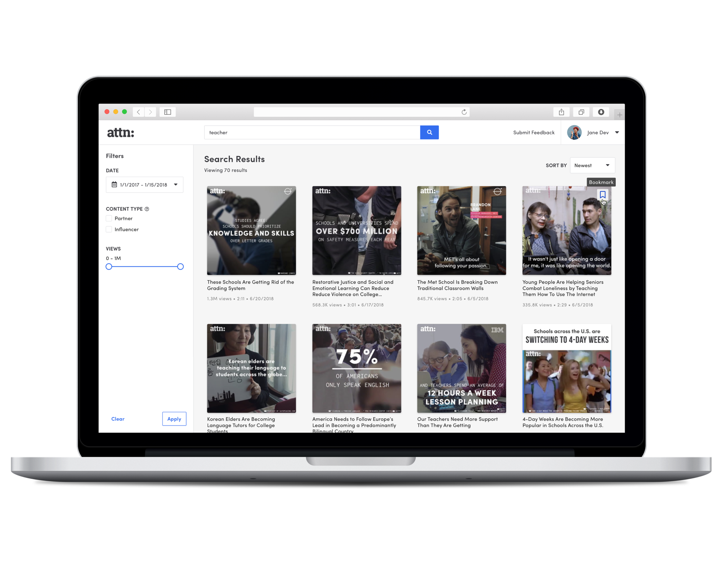
Search results that reflect users’ query language and mental model

The results page displayed videos in cards that feature the thumbnail, title, description, publish date, and length. It was important to include these pieces of information because users would reference these snippets when asking others or looking for videos. I opted for the grid layout but tried to marry features of a list because users stressed that visual elements and text elements were important to the decision making process.
Search first, filter later

During interviews, users described how they would search for videos and emphasized the use of keywords more than relying on filtering results. To narrow their search down, they would use more specific keywords. Based on that, I didn't want the filters to be obtrusive so they were set in the sidebar so that users could focus on the main area and if they needed filters, they would always be accessible on the side. This design also meant we could fit more filters in the future and this treatment worked nicely with tablet and mobile experiences. The search bar was always available as well so that users can easily modify search keywords.
Easily review, share, and download videos

I avoided the larger, theater-style video player because the majority of our content was short, less than 90 seconds, and it didn’t support our users’ use case. Having a smaller player with the video description, stats, and publish history all in a single view allowed users to quickly get a sense of the content.
Once the MVP had been out for a week, I scheduled some time with employees from various team to learn about:
Overall feelings about Vault
Adoption into personal workflow and team's workflow
Usability issues
Features that would make Vault more appealing and useful
After collecting the data, I summarized all the findings and feature requests, prioritizing them based on reach, impact, confidence, and effort. The major takeaways of these interviews and our in-app analytics highlighted:
The MVP was being used by 70%+ of company with daily activity
The UI and UX was straightforward and easy to use but the results page could better facilitate in scanning. Users would focus on titles and thumbnails, not so much description.
A need for improved search quality that better supports different search techniques such as multiple keywords/tags and search operators
A desire for an easier way to find frequently referenced videos
Mobile search usability issues
V1 Design and Release: Introducing the new design system, more features, and addressing usability issues
Reworking our design language to better support internal tools
Rather than forcing the existing pattern library onto Vault, I explored color and typography options that would better showcase videos. Font sizes were reduced so that more data could fit on the page, border weights were reduced and blacks turned to grays so those bold contrasting shapes wouldn't compete with the video thumbs.
Continuing to model search after users’ habits

I surfaced tags to help users see how the video is categorized and it also functioned as another way for users to assess a video along with the publish history, description, etc. Filters were adjusted based on how users interacted with them. A content type filter was introduced to further narrow results down. I split the actions of filtering and sorting to differentiate the actions; filtering was meant to narrow down a search while sorting organizes the content. Duration was removed and view count was introduced instead because users relied on that value more than duration. Users also stated they never used the duration filter because most content was short and it wasn’t a deciding factor when finding a video.
Bookmarking favorite videos

The in-app analytics and tracking showed users visiting the same page repeatedly and entering the same keyword. When asked about favorite videos or ones that were frequently referenced, users said they would either bookmark it using their web browser’s bookmark manager or save the link in another document. Users wished there was a way to have all the videos in one location for easy referencing. With the introduction of this feature, users can now bookmark videos and quickly access them from the main search page after logging in.
Adjusting the results Cards for improved scanning

Users complained about the video thumbnails taking up too much space and the descriptions not being accurate or helpful. I learned in the following user interviews that descriptions varied based on platform and tool so users would rely on the thumbnail or the title. Cutting information from the video result card meant prioritizing content that was more critical to users’ decision making process and better utilizing the features of a grid.
Providing guidance for a better search experience

Users didn’t reference the help text on the search page because it wasn’t actually helping them. I fixed the copy so that it wasn’t as verbose and included a link out to search tips to a more detailed guide. The data team worked in parallel, updating the video metadata to support a more robust search.
Accounting for mobile users

The majority of our users access Vault on their desktop so most of the design decisions were made in the context of that breakpoint. However I made sure all components were mobile responsive and worked on smaller screens as well for our users who were on the go and needed to reference videos on their phones.
Takeaways and future improvements
Video assets are tough and visual wildcards
While working through the wireframes for the MVP, everything looked clean and simple. I was pretty confident that users wouldn’t have any issues browsing the content and finding videos. Turns out I was in for a surprise when it came to the high fidelity stage and started adding in the thumbnails. Thumbnails varied immensely; some were only images, some had bold copy all over, others only had a lower-third, and based on the project the branding was different. I was used to working with assets that were meant for a specific location, working harmoniously with the design and copy. For this project, I had to adjust the designs to make sure it wasn’t competing too much with the video title.
Future improvements - seamless integrations designed around specific users and their use cases.
For upcoming updates, it would be interesting to see how we could further integrate the product into employee’s workflows, creating more of an intelligent/responsive product. For starters it would be good to provide more customization within the platform such as allowing users to toggle between list and grid, organizing/managing their bookmarks, and shared video folders between teams. Maybe even extending the product beyond the site and creating a plugin that allows teams like Brand Partnerships and Sales, who are constantly in communication with brands and clients, to input videos directly into email they’re drafting instead of navigating to Vault then going through the motions there.