ATTN: Redesign
Redesign of ATTN:'s online presence to showcase our body of work, brand story, and the creative services we provide for potential partners.
ATTN: Redesign

This redesign focused on presenting the ATTN: brand after its pivot to video. It highlights our best performing video content, our brand story, and the creative services and opportunities for potential partners.
I worked along side another product designer, my manager, and the product manager to conduct research. I collaborated with my team during design iterations, working on all the pages and components throughout the website, to tackle the rigorous deadlines and led the high fidelity mock finalization and cleanup for handoff.
Year
2018
Company
ATTN:
My Role
Research, Prototyping, Branding, Visual Design, Interaction Design
Problem
When ATTN: launched its website in 2014, the company focused on writing and publishing news articles, serving as a destination for our audience to engage with important topics. As the media landscape shifted, ATTN: realized an opportunity existed to become early adopters of the new (at the time) Facebook Video feature. ATTN: shifted its editorial resources toward video content and the need for a dedicated owned and operated website became less of a priority.
Resources were focused on creating specifically short- and mid-form video content and ATTN: began ramping up its efforts on forming strategic brand partnerships, serving as a production house for third party and white label content. With all this growth, we’d seen an evolution of our brand that was evident in our social posts and editorial content, but less on our existing website.
Research
We wanted to validate there was a strong need for a redesign and gain a baseline of how the brand and website resonated with viewers both within the industry and outside of the industry. We were also interested in learning if the content we internally viewed as high performing was aligned with what our viewers perceived. To do this we:
Meet with stakeholders to understand if and how the website affected their communications with brands and clients
Interviewed ATTN: employees and their experience sharing attn.com with others such as family members, friends, prospective clients
Conducted guerrilla interviews with possible viewers to learn how they interpreted ATTN:’s brand and purpose
Researched how competitors organized their video content and the overall user experience
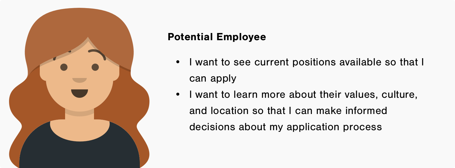
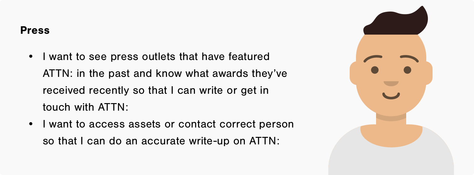
There are three specific personas the website would need to cater to
Based on our conversations with stakeholders and current employees we learned there are three specific personas who would be interacting with the website along with the general public.
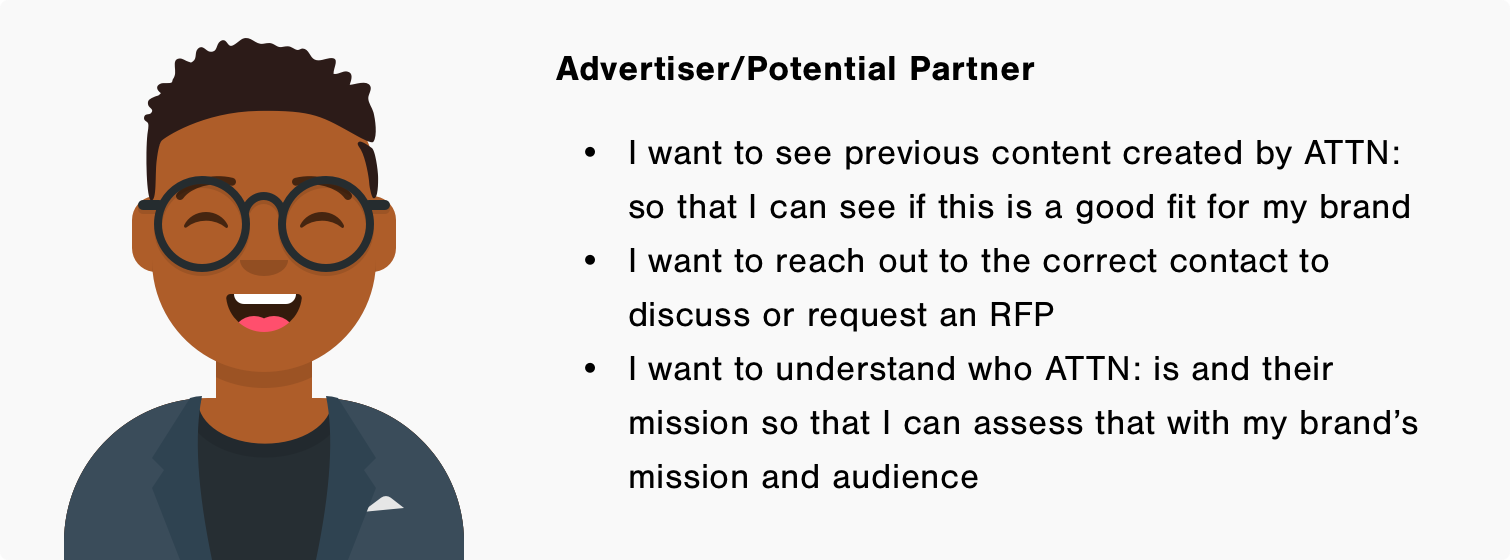
While there is some alignment on what ATTN: is and its mission, there is an opportunity for it to be much stronger.
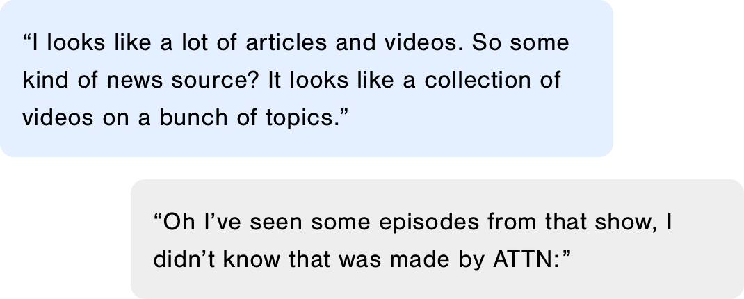
Interview participants could tell from the website that it was some sort of news or publication outlet however when asked to further describe the website, the responses didn’t convey ATTN:’s brand or mission. When prompted on some of ATTN:’s popular original series on Facebook, some participants were more familiar than others but majority stated it was not clear from the website that ATTN: created and produced those series.
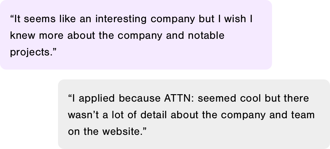
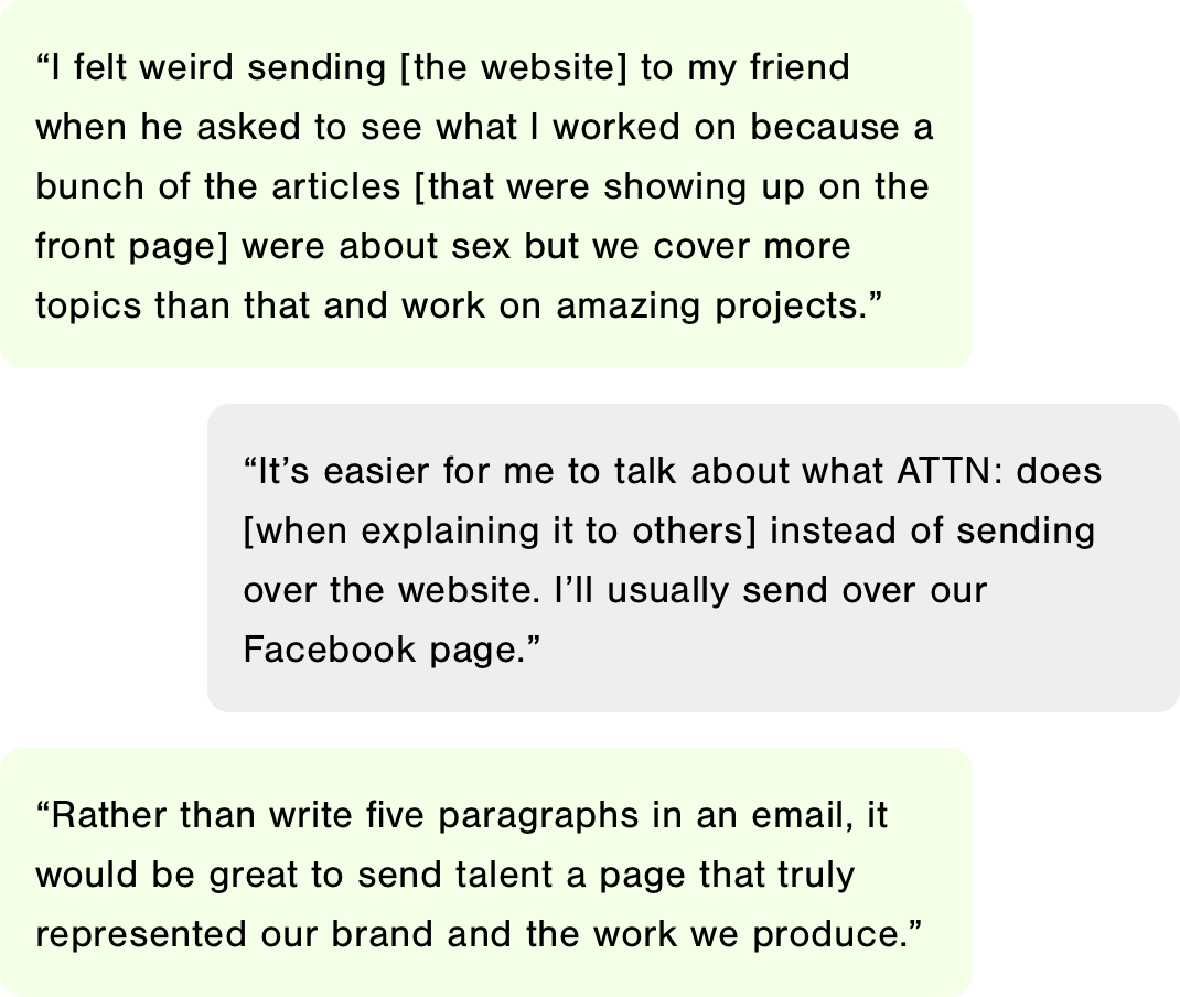
We learned because the website didn’t accurately portray the type of work ATTN: produced, participants would find other ways to share work instead of relying on the website. These discussions validated our need to produce a better digital business card for ATTN:.
We realized there was a need to better highlight the team and its work to help not only draw in bright talent but also highlight what makes ATTN: culture unique and worth joining.
Ideating and pair designing
We wanted to maximize mental resources as well as get into the flow of working closely on solving the same problems so we started off with a team brainstorming session to draw out concepts for each page. Before our session, we went off to do research types of solutions that existed for similar problems. This helped the team align and discuss on the goals of each page before going off and working individually to generate more component variations.


We focused on exploring options where we could reuse components because it would help maintain some visual consistency and reduce some engineering work. Overhauling a website is no small task, and it would be much more labor intensive for our engineers to have to create new code for every unique aspect of the website. Reusable components also made it possible to lessen the engineering burden once the site was handed off to development.

The Redesign
Presenting the ATTN: brand and its video content

In order to reinforce ATTN:’s brand, body of work, and offerings, we looked for opportunities to incorporate our video content, voice, style, and talent.
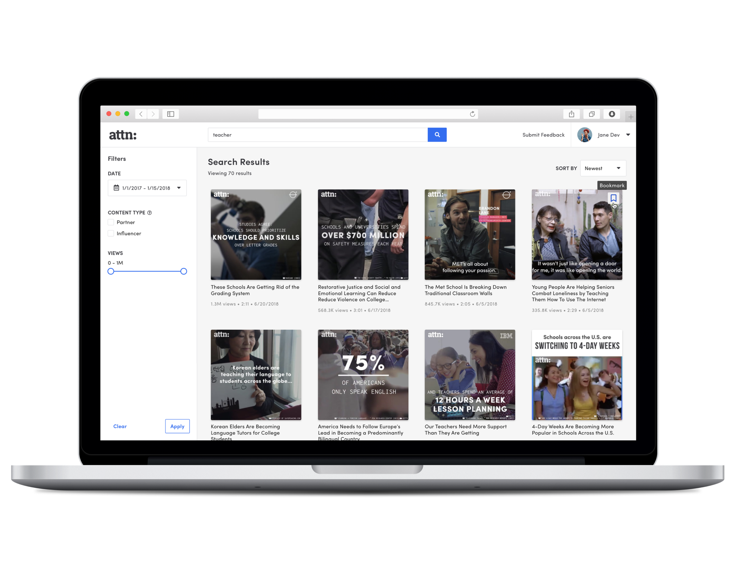
The home page features a full-bleed snippet of our work, briefly showcasing talent and topics that ATTN: covers along with a strong tagline that encapsulates the ATTN: brand. To showcase ATTN:’s best and current work, we created a viewing experience that mimicked an immersive theater to allow the content to shine. Users have the option of getting a feel for our work or spending time on the respective platforms to watch our video content.
In addition to working on the user experience, Product Design collaborated with Creative to nail down branding. We explored both light and dark themes to better understand how color could convey a brand’s personality and worked with ATTN:’s video content. We focused on a clean, simple approach, relying on color blocking sections and sparingly using the brighter colors in our palette. This direction would appeal to the advertiser and press personas who we needed to push through the conversion funnel to hit the goal of contacting ATTN:. By taking a minimal approach, it gave the brand a refined agency feel that guided the user to focus on ATTN:'s work, accomplishments, and what ATTN: could do for their brand if partnered with us.

Telling the story of ATTN:’s growth and promising future

To help build ATTN:’s story and create a compelling reason to work with us as a brand or join the team, we designed an interactive timeline that users can learn about ATTN:’s past and exciting upcoming projects. To further encourage potential partners to reach out, we followed the timeline with press to highlight achievements and establish our presence within the industry.
Appealing to potential employees

Similar to the About page, the Careers page features a video so that viewers can learn more about the company culture and get a look into the team and office. To help potential employees with their decision making, we also included office location and a break down of our benefits prior to presenting them with open positions.
Rethinking the purpose of the blog

Rather than leaving the blog as is and applying the updated visual styles, we wanted to use it as an opportunity to also help build the ATTN: brand and drive additional traffic to the website. Topic filters were added to help with navigation but also to establish authority regarding those topics.
Creating a smooth transition for users visiting the legacy site

Since the website was undergoing a significant redesign, we wanted to make sure users who were engaging with us on the legacy site would be guided to the new site. We also accounted for dead ends and 404 pages, designed a way to inject ATTN:’s brand and opportunity to watch content in those pages.
Takeaways
Know your audience when seeking stakeholder approval.
This project went through many approval meetings with lots of different types of a stakeholders. It’s critical understanding who they are, what their goals are, and making sure to address those especially since getting time on the calendars can be difficult.
Learn how to collaborate and clearly communicate with other teams.
The redesign involved many departments at the company, we needed to work with Creative on branding and static assets, Post-Production for video assets, and Marketing/Communications for copy. Product Design worked through the best way to make these requests and follow up with the different teams. Don’t assume the process that your team is used to is the same other teams, be flexible and figure out how to incorporate their workflow into yours.