Friendbuy
Redesign of the campaign editor, making it easy for businesses and marketers of all levels to create, configure, and design their referral marketing campaigns.
Referral Marketing Campaign Editor Redesign
This redesign of Friendbuy’s heavily used campaign editor addressed usability issues and introduced new features giving marketers the ease and freedom to create, configure, and design their referral marketing campaigns.
Year
2016-2017
Company
Friendbuy
My Role
Research, Prototyping, Branding, Visual Design, Interaction Design, User Testing, Analytics Tracking
Problem
As the Friendbuy platform grew and new features were introduced into the editor, it became difficult for the initial design to handle these additions. The lack of a dedicated style guide, clear onboarding, and in-app guidance caused the editor’s user experience to suffer. We saw an increase in support tickets, a slow down of basic plan sign-ups, and dissatisfaction with our basic plan users linked to the usability issues.
Research
Dig through the data you’ve been collecting

Sitting with the customer support lead to discuss platform pain points.
I started with the customer support lead, talking to him about the most common complaints. We reviewed a breakdown of support tickets categories which showed the top themes: usability issues, reward setup, and feature requests.
I went through the customer support inbox to collect specific feedback regarding the builder and the experience of creating a referral campaign.
Evaluating platform usability
I conducted contextual inquires with our Accounts and Creative team members since they interacted with the builder and campaign editor on behalf of their clients. In these sessions, I learned that experienced users some times forgot how certain settings worked or where they could find them.
I also scheduled remote usability sessions with new and experienced users using the concurrent think aloud technique to see if there were any shared pain points. It was also helpful seeing the exact moment when users became confused or stuck to see what they would do.
Based on the meetings with stakeholders and users, the existing platform:
Failed to provide in-app guidance on setting up a referral marketing campaign
Overloaded users with options and settings that used internal language
Didn’t have robust preview, editing features, and sandbox setting which made users nervous about making changes or reverting back to previous settings if they accidentally made a change
Confused users with inconsistent styling of the editing components and other UI elements
Goals of the redesign
Guide users through the referral marketing campaign creation process
Provide users with the confidence to manage the visual aspects and configuration of their referral marketing campaign
Design the editor to be more flexible and able to grow as more features are introduced
Reduce visual inconsistencies of UI patterns
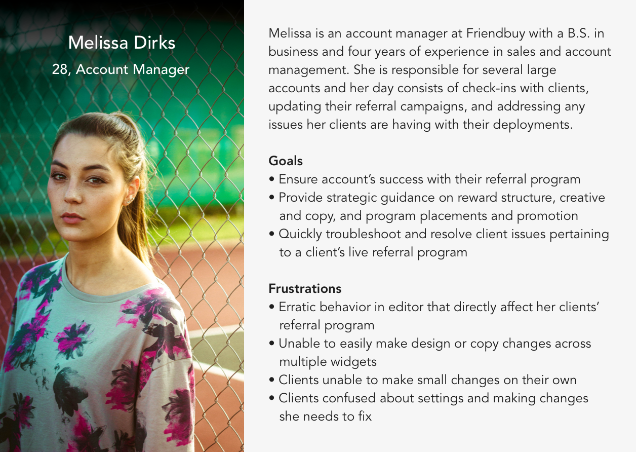
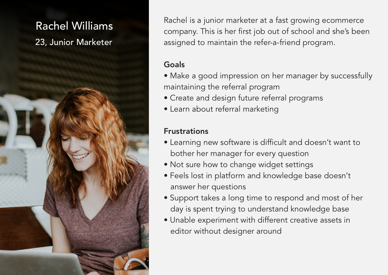
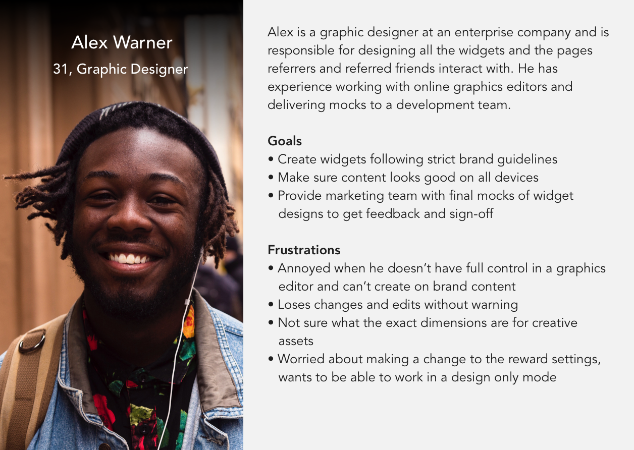
Personas
User Flow

Getting all the ideas down on paper
Separating steps of campaign creation
I explored different ways to break down tasks into logical, bite-sized chunks. By separating out the steps, there was also more opportunity to provide users with in-app education. Smaller steps also meant users would be able to see the progress they were making and feel accomplished with something that initially was foreign and daunting.

Crazy eights brainstorming to quickly get as many ideas as possible.


Testing with users

I scheduled remote user testing sessions with newly signed up users and power users from our basic tier plan.
Users still not confident setting up their campaign
Users were excited to see the break down of steps but questions that often came up during the session were, "Do I need to do x action?" or "Do I need to fill this out?" Users were also unsure who the rewards were for, asking if setting a reward would send it to the friend or referrer.
Navigation within navigation within navigation ≠ Good UX or UI
The layers of navigation were causing users to be confused, especially when they were on the Widget section. top navigation feeling too heavy, cognitive overload in some of the steps due to the amount of information presented in the sidebar, difficulty navigating within sections
Implementing design solutions
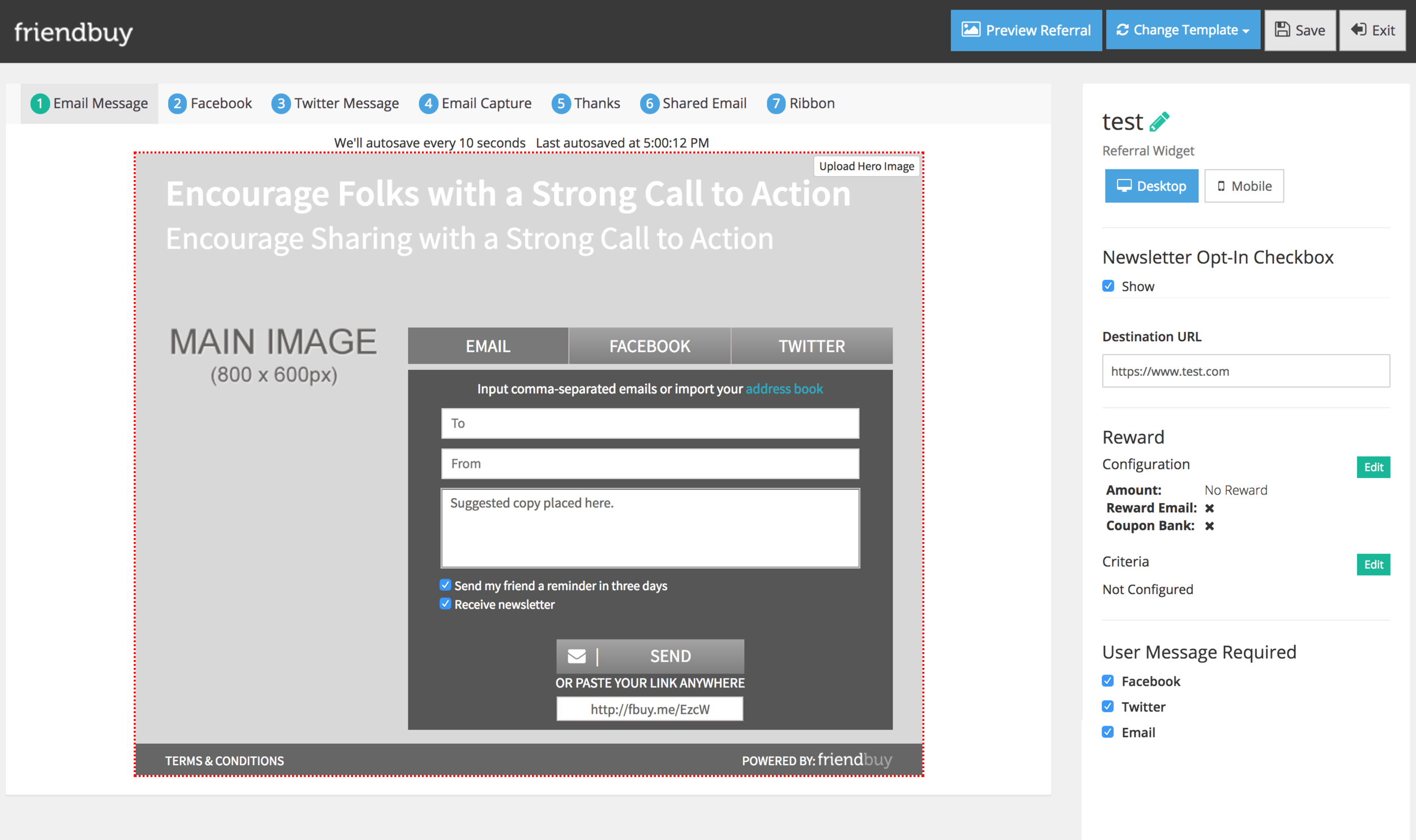
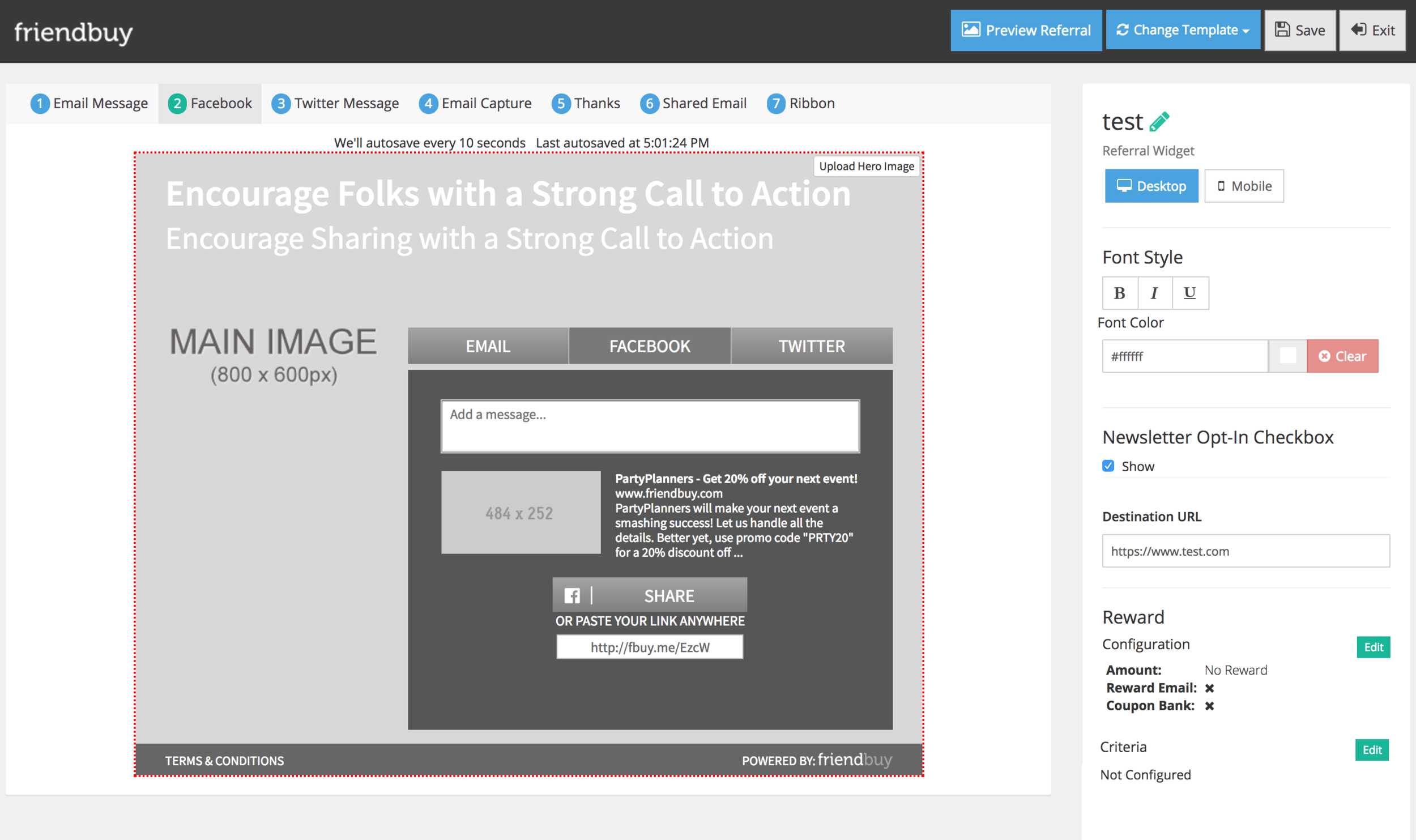
Guide users with a progress bar

The progress bar was moved to a more prominent location, fixed to the bottom of the screen where users can always reference where they are in the process. Users have the option of using the back and next buttons also move them along or they can jump to a specific step. Separating the progress bar and the save/preview actions at the top reinforce the concepts that the actions at the top are used when the user is ready to exit or save, while the actions at the bottom at used when working on the campaign.
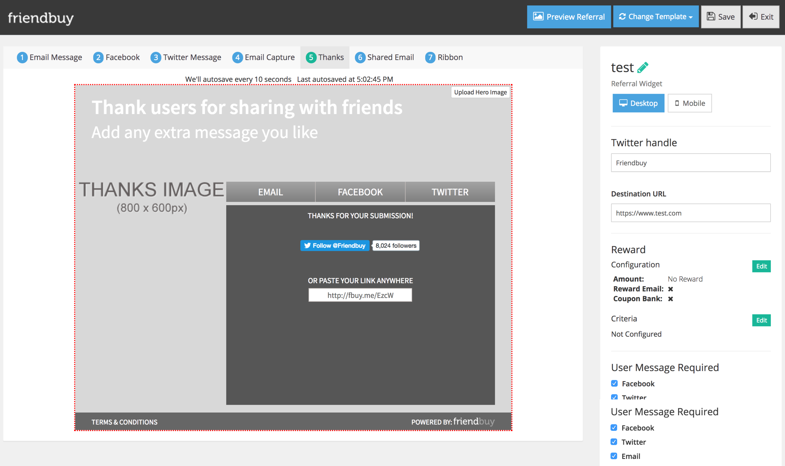
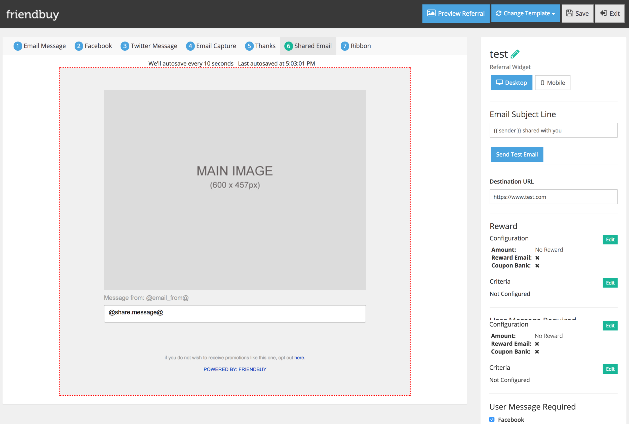
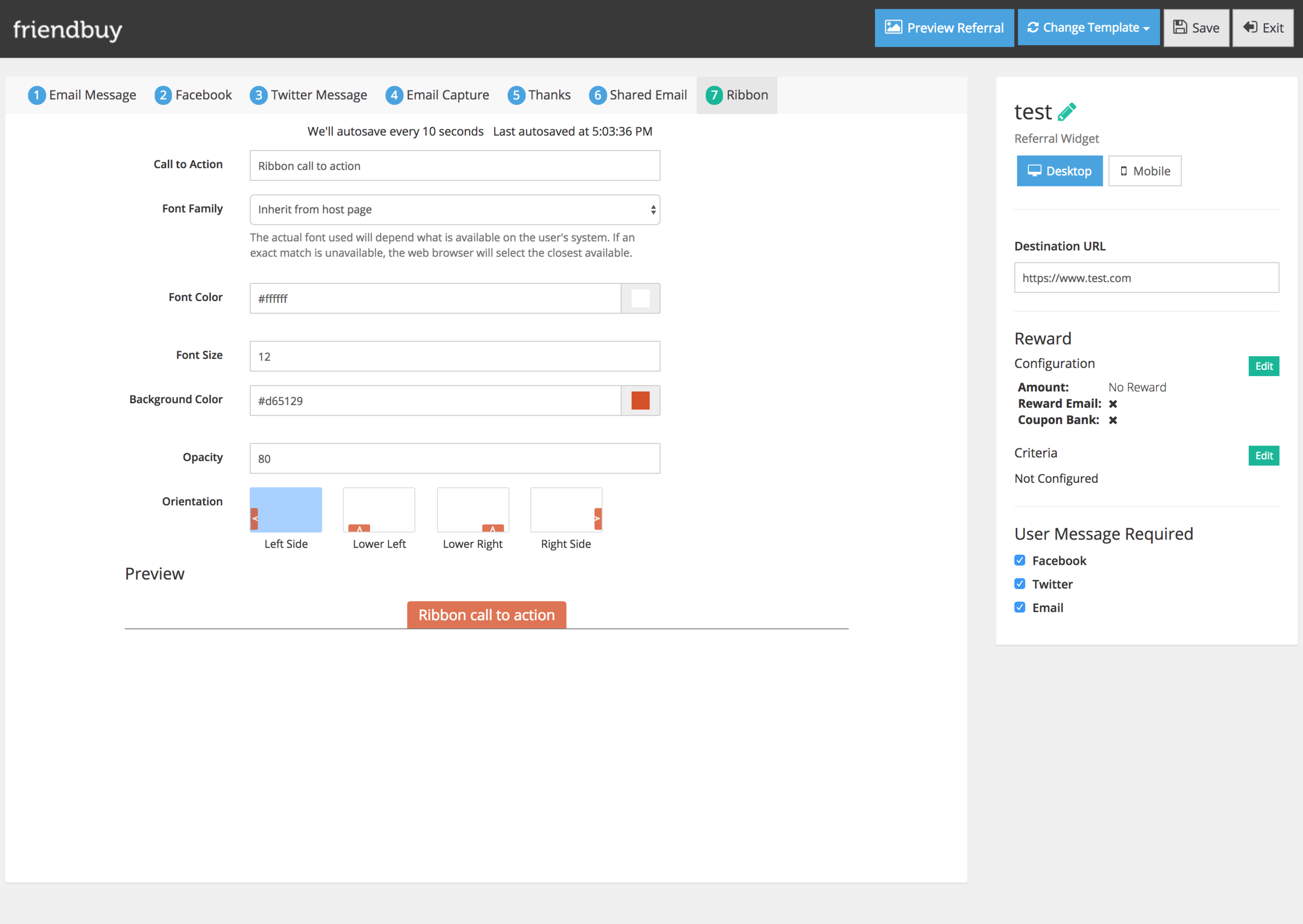
Show realistic previews when possible

At any step of the editor where there was a visual component or output, the new editor made sure to show that in the canvas area. Display Settings gave users a preview of how the referral campaign form would appear, users can select between pop-up and embedded to see it in real time.
Set up steps in a way that maps users’ mental model

In addition to splitting out the steps, it was important to arrange them in the order that aligned with users’ mental models. By finding a balance of matching users’ expectations and giving them clear indication what was coming up next, this helped build confidence in the platform.
Separation of visual editing and configuration settings

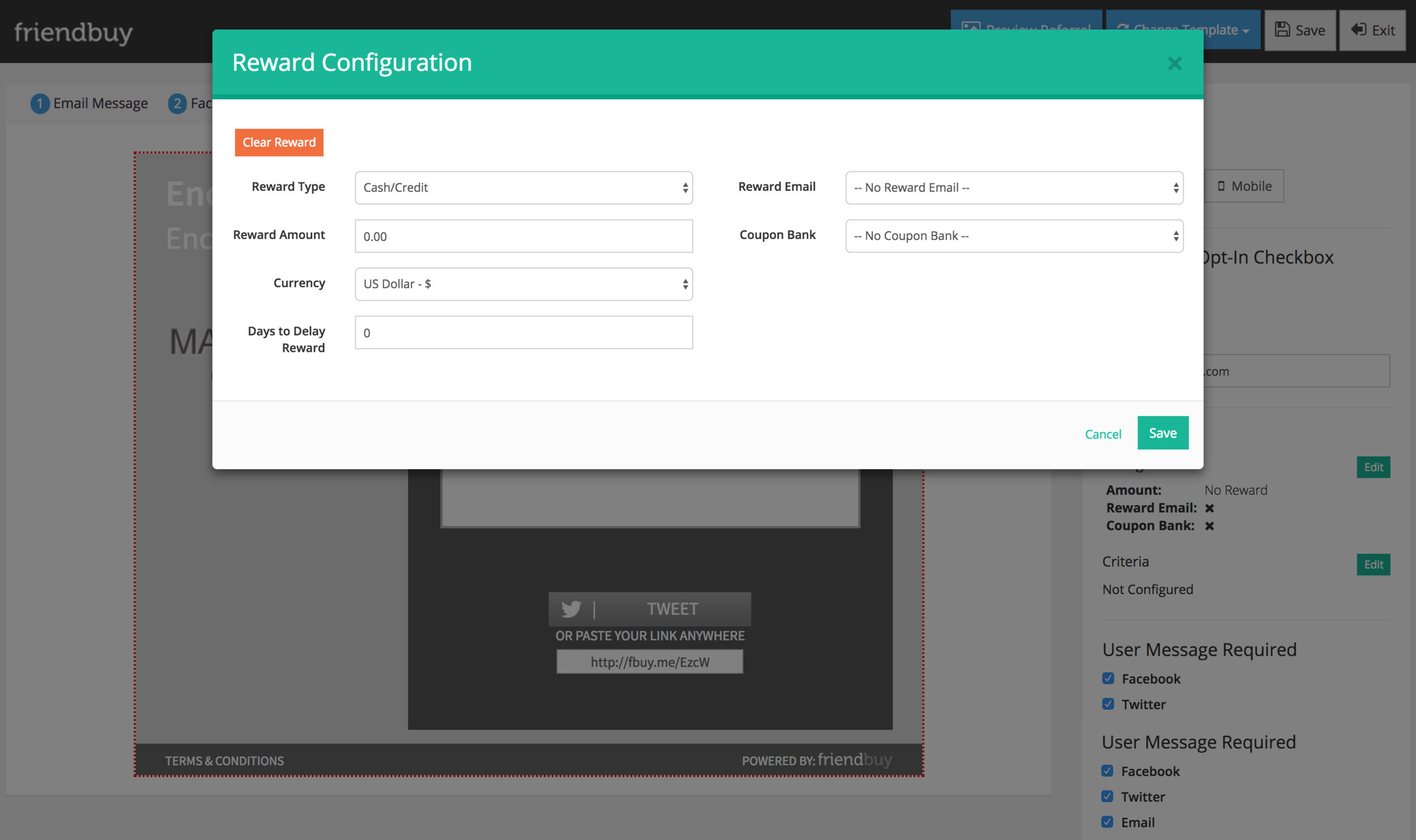
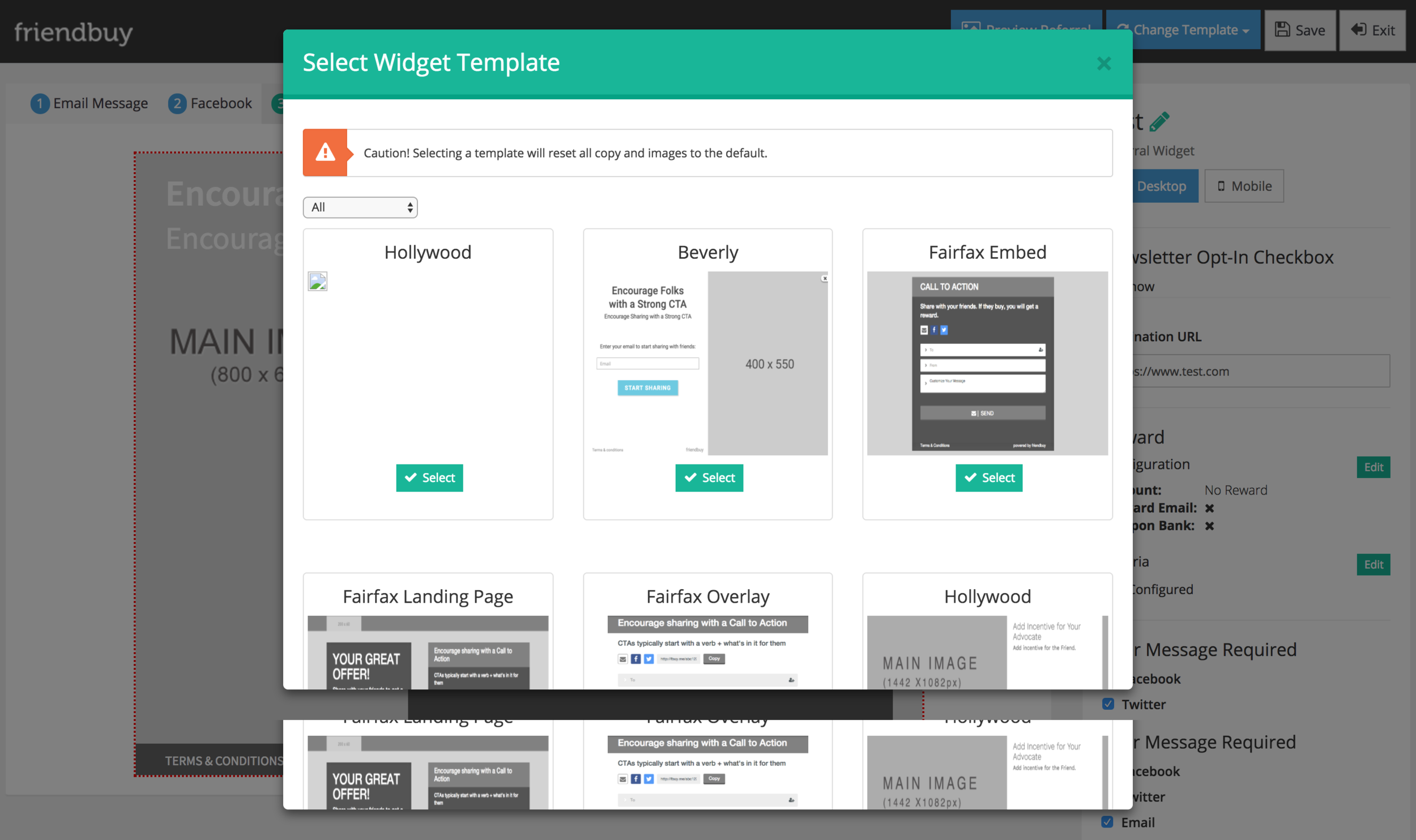
Setting up a referral marketing campaign is daunting as it is so rather than showing every possible setting, the new editor only shows the user what they are working. By default, the side bar shows the general settings and the library of add-ons however if they user clicks into an element, the side bar shows all the designing options. Dividing the settings this way also provides a scalable design when more features are introduced. This was also a great opportunity to consolidate design styles and reduce nested navigation.
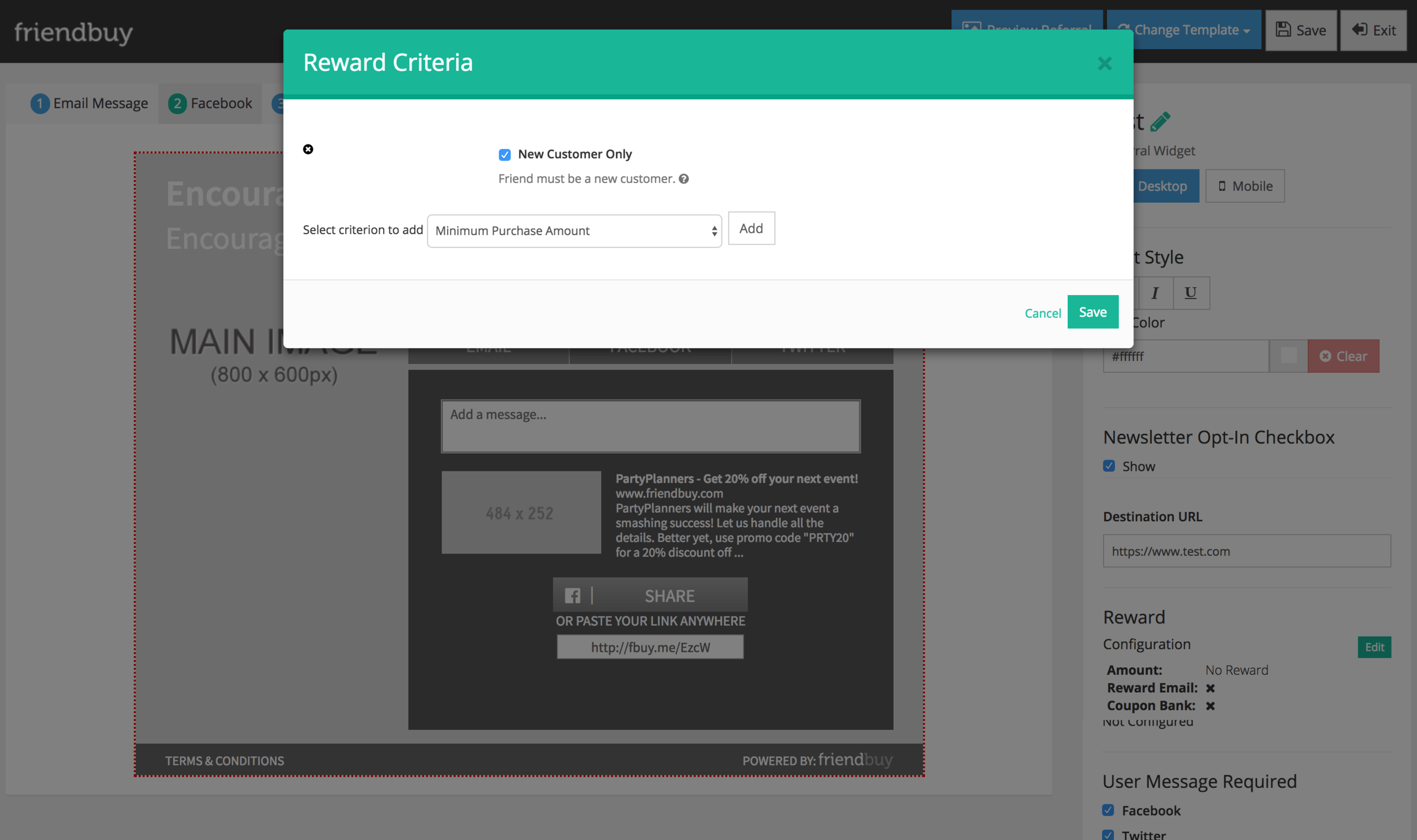
Set up safety nets for users

Settings and editing options are all designed to be forgiving. If the user removes a share channel, they are able to see where it went, how it effected their campaign, and easily bring it back. Users can navigate back to a previous step without concerns of the platform erasing any work.
Measuring product success
The editor will be measured using Kerry Rodden’s guideline on metrics which monitor business metrics and UX design metrics. Business metrics such as number of sessions in editor, revenue generated by editor, etc are useful however they aren’t good indicators of UX and usability.
For this project, I’m interested in UX metrics that reveal:
Happiness
How happy are our users with the new editor experience?
What’s the overall level of satisfaction?
Engagement
How engaged are users with the product?
What features are they using?
How long are users spending in the editor?
Task Success
Can users configure a reward campaign with confidence?
Can users design a widget that’s consistent with brand guidelines or what they had in mind?
I plan on sending out Net Promoter Score surveys to gauge happiness, reviewing customer user flows and activity in Intercom and Mixpanel to see how users are engaging with the builder, and setting up funnels to see where users drop off when completing tasks.
Takeaways
Find a way to conduct research and test your ideas
User research and testing often takes a back seat in smaller companies because there isn’t enough time or a budget. Testing with 5 users might not be statistically significant for all research methods but it’ll provide more validation than designing in a vacuum. The worst case scenario is building something that users don’t find valuable or usable.
Understand your users and advocate for their needs
One of the biggest learning experiences for me was figuring out when to push back on scope, timeline, and designs. In the initial designs, the product and business team looked at other editors, sending me examples. I was initially hesitant of the side menu and toolbar but since it seemed to work for other editors, I thought it would work for ours and explored those options. The side menu within the left hand panel did not work for our application due to the complexities of the settings. It ended up making the editor look visually heavy and confusing.